Image Editing Style Comparison
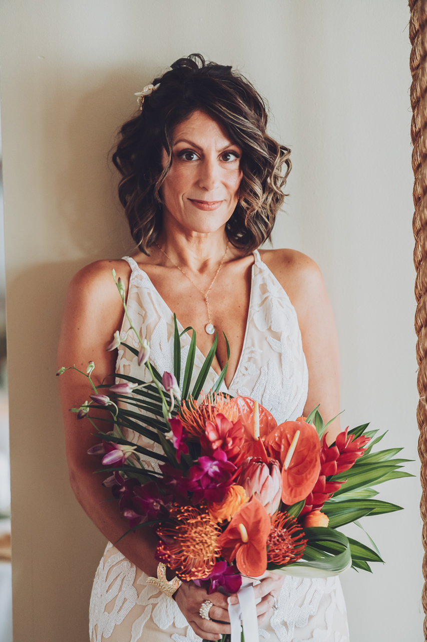
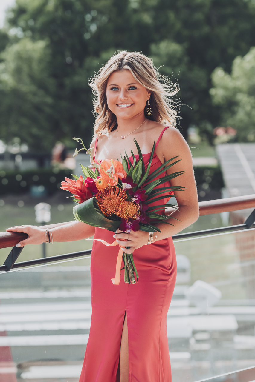
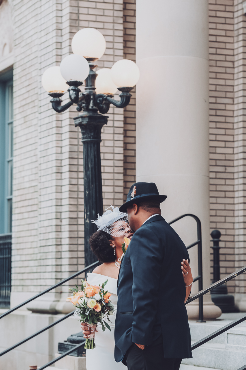
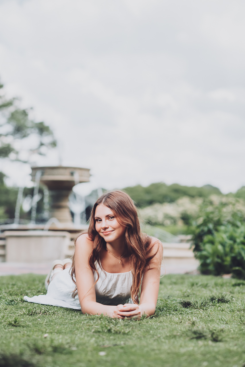
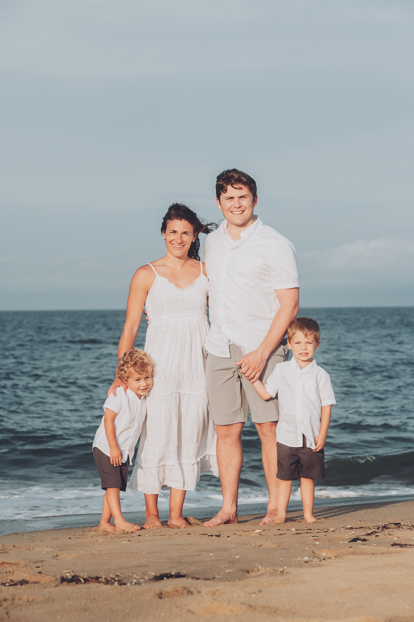
Color plays a huge role in how your photos feel. Some couples and families love bold, vibrant color that really pops. Others prefer soft, neutral tones that feel light and understated. The good news is you don’t have to choose blindly.
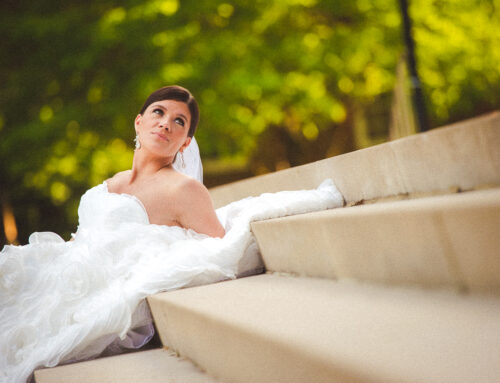
When I photograph a wedding or portrait session, I capture and process everything with clean, accurate color first. From there, I can gently guide the final look in two directions: Vibrant Color or Soft Neutral Color. Both styles stay natural and true to life. The difference is simply how bold or subtle you want your images to feel.
Below, you can drag the sliders on each photo to compare the two looks side by side and see which style speaks to you most.
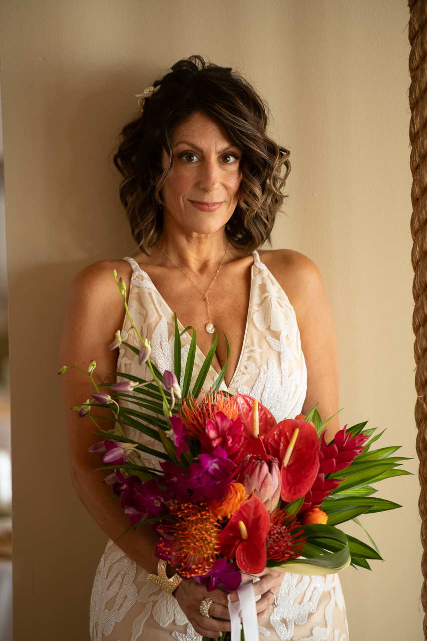
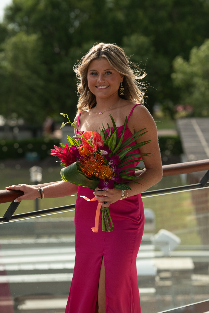
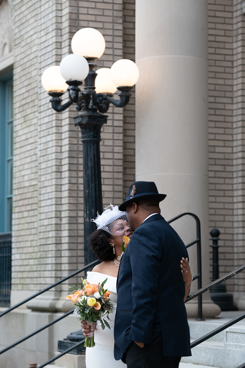
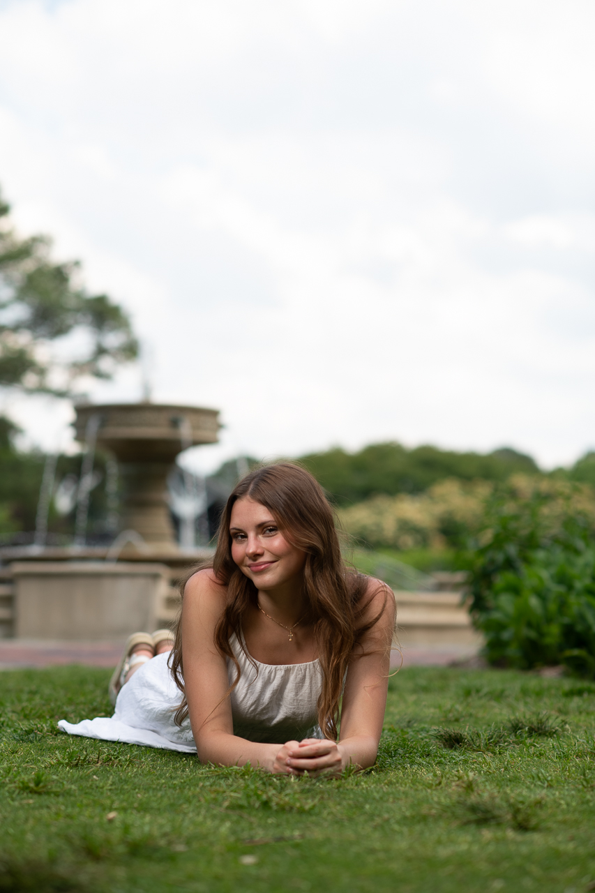
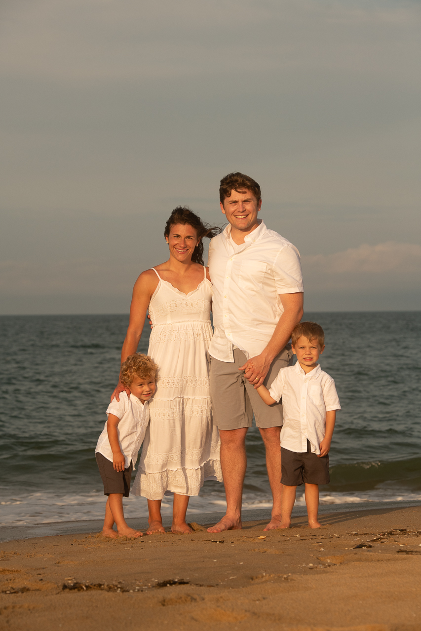
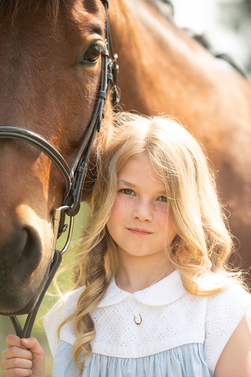
Vibrant Color
The Vibrant Color version keeps deeper blues, richer greens, and stronger contrast. It brings out the energy of the scene and makes flowers, skies, and décor stand out beautifully. This is my current default style.
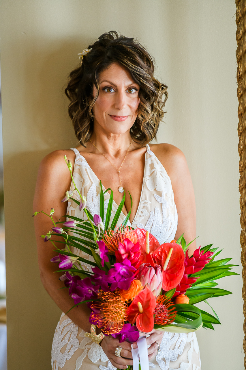
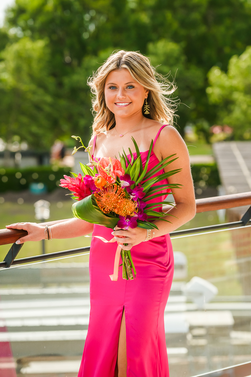
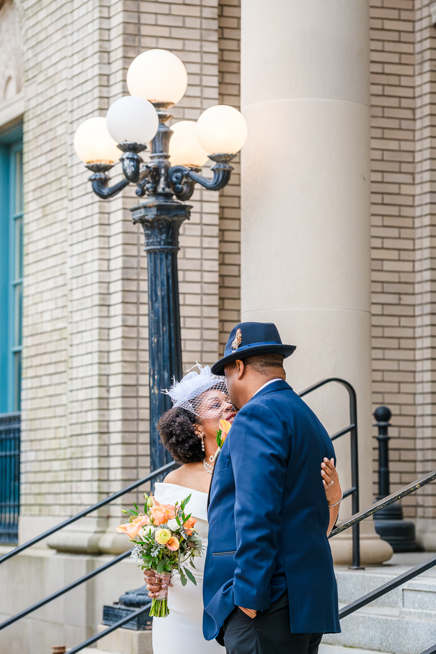
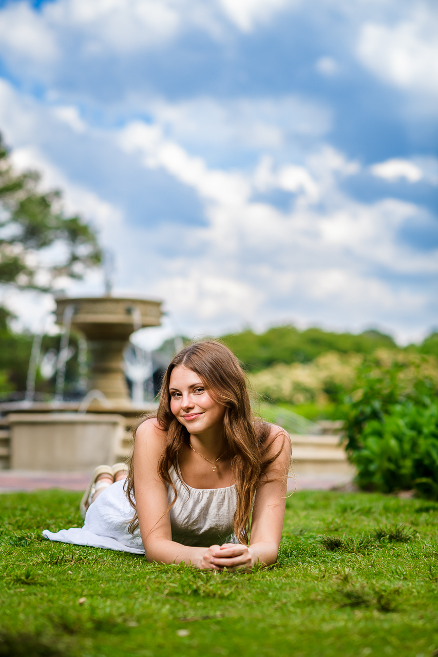
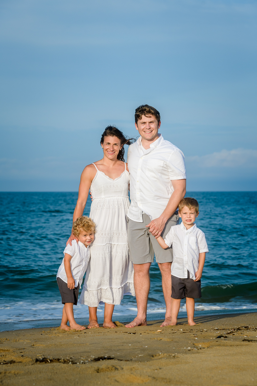
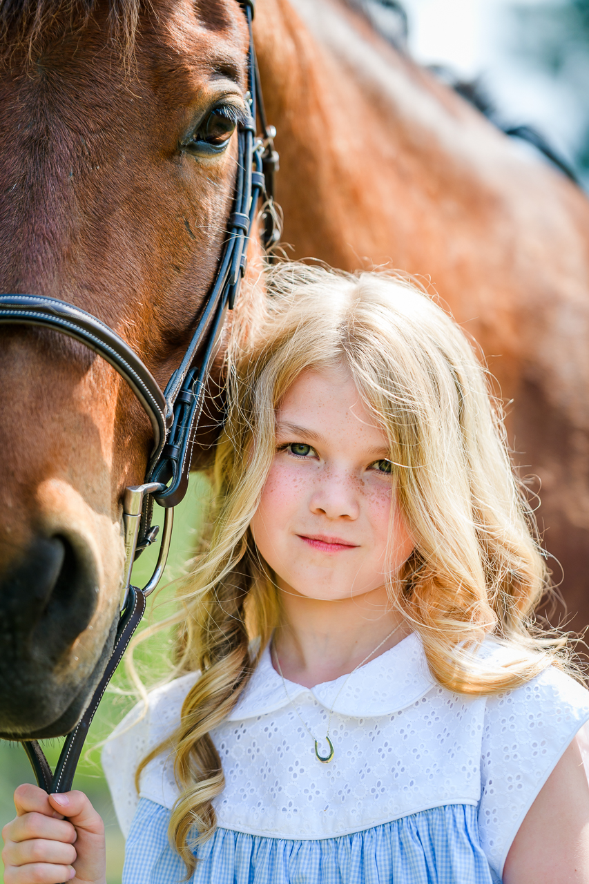
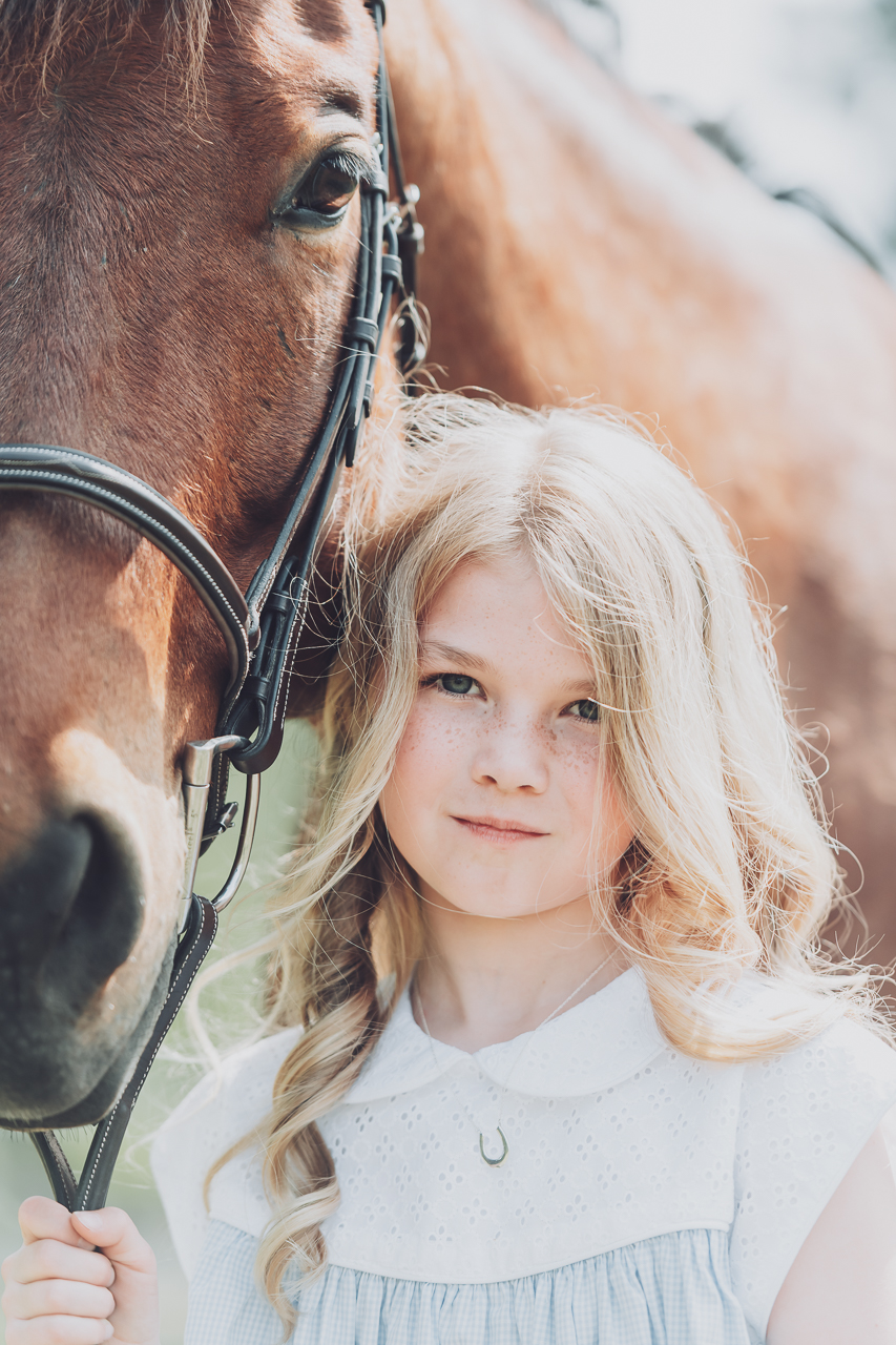
Soft Neutral Color
The Soft Neutral version tones everything down slightly for a calmer, more delicate feel. Colors are still accurate, just gentler and more muted. This look feels light, airy, and timeless. This style is available upon request.
Choosing Your Style
There’s no right or wrong choice. It simply comes down to what feels most like you.
If you love bold color and a little extra pop, Vibrant may be the perfect fit. If you prefer soft tones and a more subtle, elegant finish, Neutral might be your favorite.
Either way, you can expect clean skin tones, natural light, and consistent editing across your entire gallery.
If you’re planning a wedding, engagement session, senior, or family portraits and want photography that matches your personal style, I’d love to chat and learn what you’re drawn to most. Contact me today to check my availability for your portraits or wedding!
Keywords: vibrant color photography, soft neutral photography, photo editing styles, natural color wedding photography, family portrait editing style


Leave A Comment